
24 Feb
2014
24 Feb
'14
4:18 p.m.
Hi everyone,
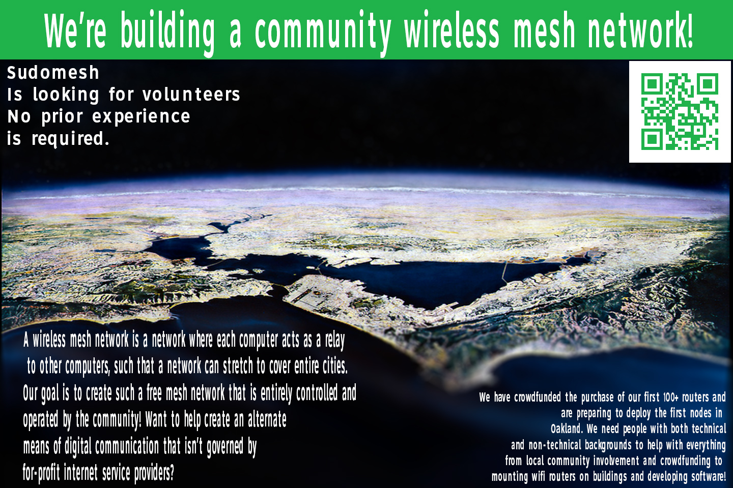
It’s Alex Merenkov from last Thursday’s meeting. I’m one of the two graphic designers that
came to the meeting last Thursday and I’ve been working on a postcard to promote the mesh
network.
Today i have created a rough draft and wanted to get everyones input on the copy and also
the design layout.
The design layout i choose similarly fallows the design of whoever made the website for
https://peoplesopen.net/
As such i used the same color from the Nav bar on the website and a picture of the bay
area that i used a Tilt-shift effect on much like the photo on the website of lake
Merritt. I added a QR code which directs to the website itself and stuck that in the
corner. I wasn’t sure exactly what to put in as far as copy goes so i mostly copied and
pasted what was on the mesh website that describes the meetings. I would love to hear any
suggestions as far as text goes and also what everyone thinks of the aesthetics. For the
font i used RoadGeek 2005 which is the same font used in all of the Oakland Street signs
it is easy to read and not obnoxious like the font the city of Berkeley loves to used
called Alan Cairns so i thought it worked nicely but we can do any font you guys think is
best.
Hope everyone is doing well. : )
Sincerely,
Alex S. Merenkov
Berkeley, CA
4519
days inactive
4519
days old
0 comments
1 participants
participants (1)
-
 Alex Merenkov